Design Grids in Sketch. A complete guide on how and when to use grids.
Design grids is one of the most important part of any design projects. Designers should always spend some time, at the beginning of any UX and UI project, to choose a grid and then stick to it.
Sometimes it can be difficult. How do you choose the right grid? How do you know if your choice is the best for your design?
In this quick tutorial we will explore how you can create a simple grid for your project and what are the best practices to choose a grid.
Contents
Choosing a grid
Setting up a grid
Managing a responsive grid
How to use grids
1 Choosing a grid
The first step, when starting to set up your grid, is to decide how many columns your grid should have.
While a 12 column grid is the most commonly used grid, there is no one-size-fits-all when it comes to grids. Your design will dictate what grid you should use. And, especially if you are a beginner, don't be afraid to change your grid if you realise that it doesn't suit your design once starting to work on it.
Below are some basic steps to help you find out which grid works best with your design.
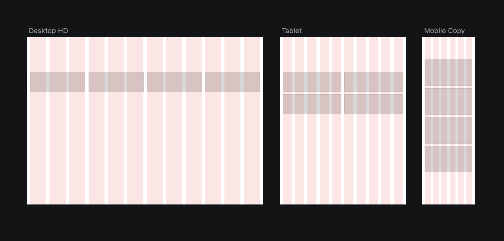
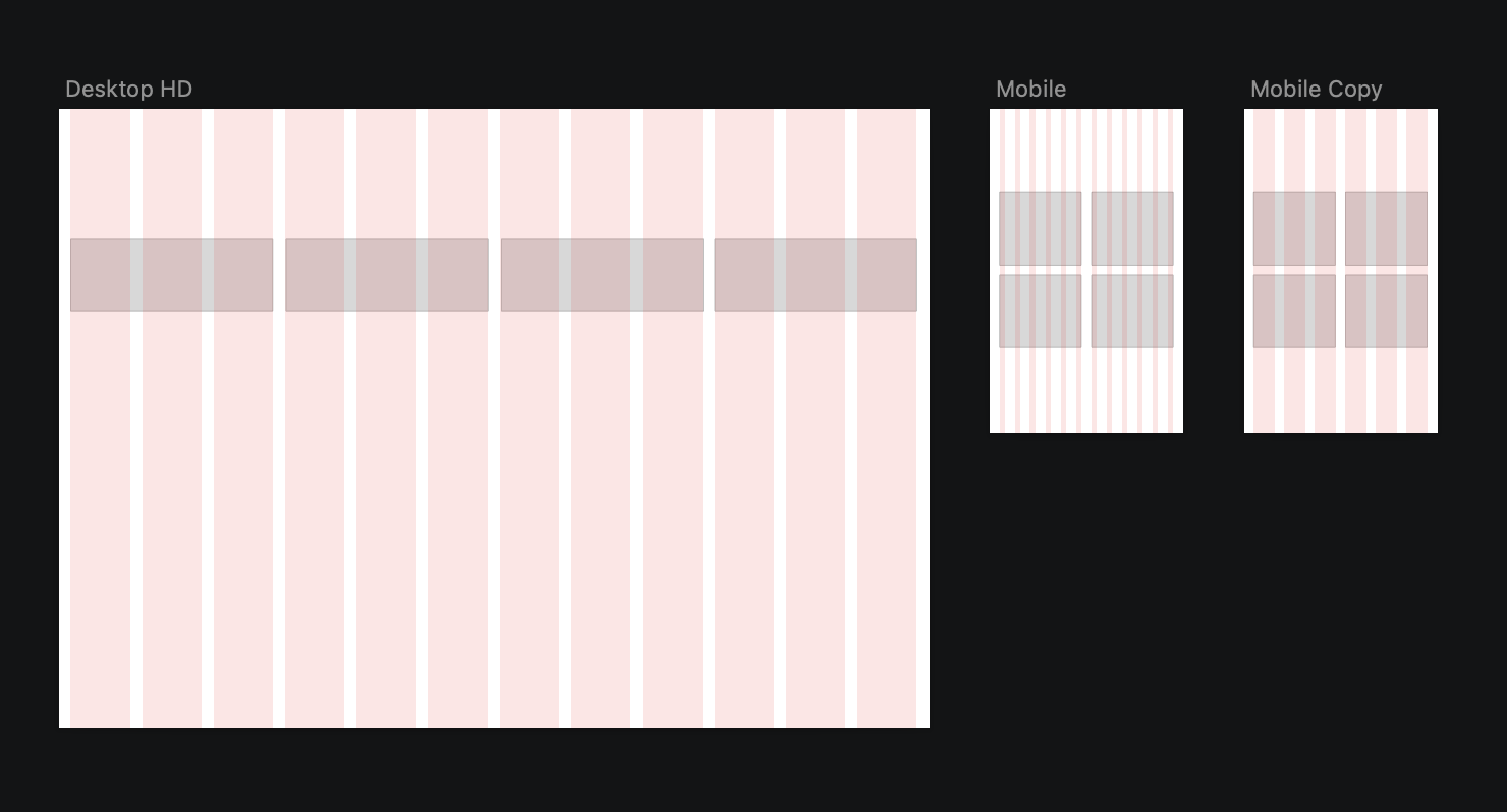
How many macro columns do you want to use?
Think of Instagram, the images are on a 3xN column. In this case, a 12 grid system, where each macro column spans 4-columns grid will be ideal. But if you want to use a 2-macro-columns design, then 12 (6+6) and 8 (4+4) or even 6 (3+3) and 4(2+2) columns grid will work (image above).
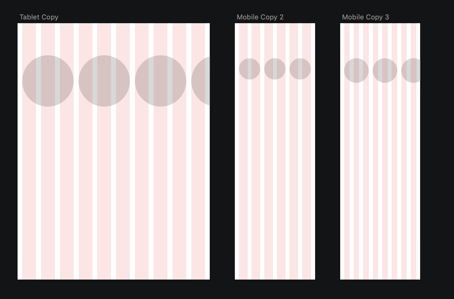
Will you have sections that slides?
If you know for sure that you will have a horizontal sliding section in your app or website, then you want to make sure you choose a grid that allows for the items to fall outside the last column of the grid as shown below. Depending on the rough size of the elements you want to create, you will be able to make a decision. Usually, a 12-columns grid works for desktop, while 10 for tablet and an 8 for mobile work well for this type of layouts. Other girds can also be used, but the elements will be much bigger or much smaller based on the amount of columns you use (image below).
As you can already understand, the grid that you choose will depend a lot on the designs of your product
2 Setting up a grid

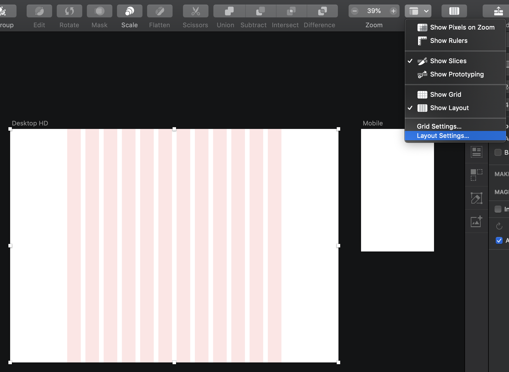
Let's see first how to view and edit your grid in Sketch. Sketch has already a preset grid in each artboard. You can activate it by toggling the button Show Layout in the toolbar to show/hide the grid, as shown in this image.
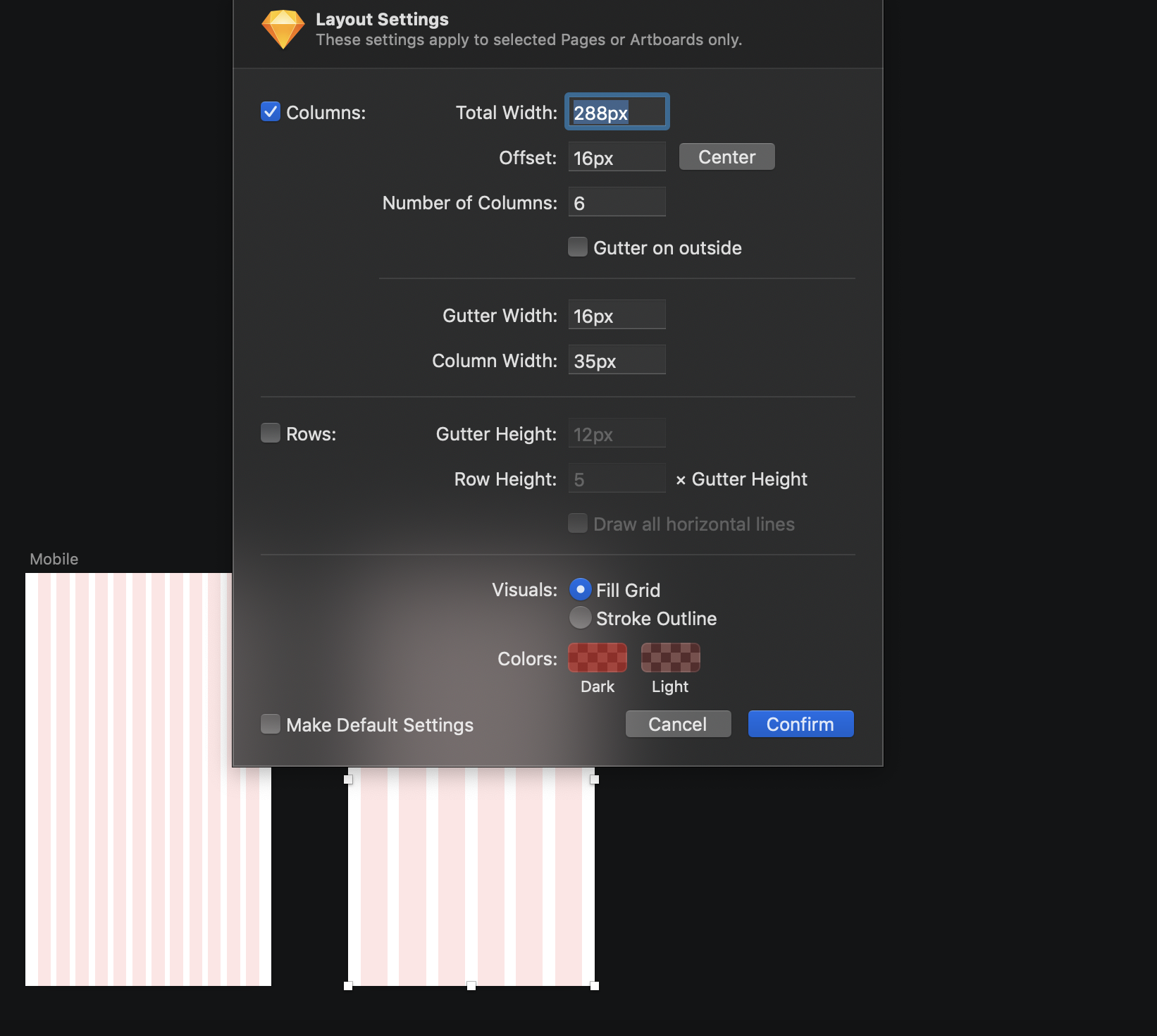
To edit the grid, use the button View and then select 'Layout Setting...' as shown here.
A pop-up window will appear, and this is where you can fully personalise your grid.
To change the layout settings lets first take note of the width of the screen that we are designing for (mobile? web? which size?).
In our case, we will set up the grids for a desktop screen of 1440px and a mobile web screen of 320px.
But the following rules can be applied to any screen size, for as many columns as needed and with any size gutter.
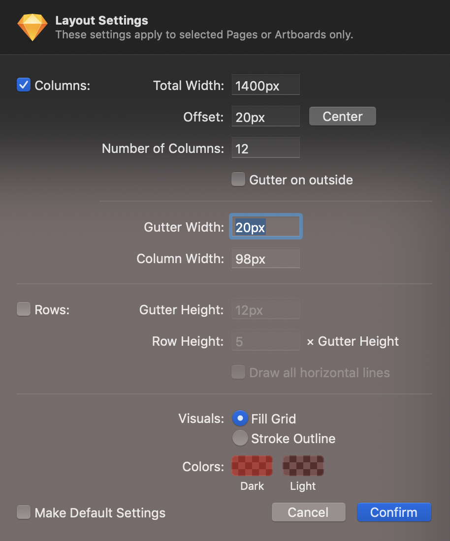
If we are considering the desktop layout, we then need to make sure our total width is 1440px.
The second thing to check is the number of columns (let's skip offset; for now, we will set it later). We want to make sure we have set them to 12 (or whatever number you have chosen for your projects).
Then let's make sure the box Gutter on the outside box is not ticked, and the gutter width is set to the amount we want it to be (20px) in this case.
Once again, it is essential to remember that there are no right or wrong numbers for your grid. Some standards are explained here in this tutorial, but grids are usually flexible to the design.
The box Gutter on the outside adds half-size of the gutter on the outside margin of the grids. So, unless you are sure that you want to do so, it is always better to leave it un-ticked.

There is a manual way to add your external margins to the gird using the Offset input.
To do so, you should follow these steps:
Decide what your external margins will be. In our case, we are adding 20px on the right and 20px on the left
We need to remove these margins from the total width of the grid. So we need to edit the Total Width input to be the full margins width less than the initial size. In our case out total artboard size is 1440px and the total margins are 40px (20px left+20px right). So the new Total Width will be 1400px.
But our grid layout is not yet complete. At the moment, our grid is the right size but sits on the left margin of the artboard without leaving any margin space on the left. We need to add manually the 20px left margin that we have removed initially from the Total Width.
To do so, we need to add the margin size to the Offset. The Offset pushes the full grid from left to right by the amount entered. In our case, we need to add a 20px margin and so the Offset value should be 20px. We have already accounted for the right margin by removing from the total width of the grid.
3 Managing a responsive grid
Referring to the above image, we now have our desktop web grid set. But if we try to apply the grid to a mobile device, using 12 columns and 20px gutter, we can immediately see that it doesn't work correctly. The gutter is larger than the columns, and the columns will look too thin (middle image above).
There are a couple of options to adapt our grid to better work on our mobile design. We can change the number of columns to 6 (half of the original 12) and set the gutter to 20px as initially for the web, or we can reduce the gutter size between the 12 columns.
We can also change the gutter and external margins to 16px when we design for apps as that is the most common standard for grids when designing apps.
4 How to use grids

Now that our grid is set, lets see how we can start designing our layout in the correct way.
Everything you design from now on that will appear on your website or app will need to stick to the grid. This is an essential step as following the grid is what makes the difference between a great app and a poorly designed app.
A design that is correctly aligned to a grid will also be very beneficial for developers who will be able to follow correct sizes and regular shapes when coding the app or website.
You need to set some rules for yourself and your app. Once you set the macro-elements to the grid, you can start thinking about the content. Anything that goes inside the elements doesn’t have to stick to the grid but can follow some pre-set rules.
If we consider the example above, we can imagine writing some text into the grey boxes. In this case we need to set rules for our margins. If we decide to use 20px margin at the top and 10px margin on the sides, then this can become our rule and we need to make sure we keep it consistent across all our design. This means that any other text contained in any box in our app or website, will follow the same rule of 20px on the top and 10px on the sides.